The Texas FBS college landscape is a competitive terrain filled with various logos showing off school spirit. As we’ve seen, some are better than others. The design may have to do with how much budget the respective university has in their marketing department; they acknowledge limitations and use the value of creativity to compensate for budget restrictions. Others spend everything and the kitchen sink to get a result and have no excuse for the poor outcome. Here are grades for every logo in Texas DI football:
A&M
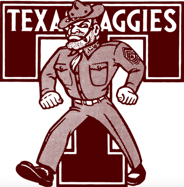
Another one of those logos you see everywhere, the maroon letters of the Aggies school aren’t anything special. The “T” for Texas (obviously) stands in place of the ampersand. Older versions of this had a goofy looking soldier, since Aggieland used to be Militaryland, where College Station was a training institution of cadets.
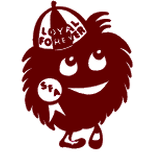
I feel like the maroon could have been toyed with, like this gem from local Texas high school Stephen F. Austin:
Grade: C-
Baylor
The Bears went full 90’s cartoon logo up until 2005, branding their merch with a lime green creature that would even be an eyesore on Nickelodeon.

The latest offering is a simple “BU” – nothing special there- that looks pretty slick on their helmet. However, points deducted for ripping off the Norte Dame threads. Squint and it looks Irish.
The secondary logo is a rip off of Memphis Grizzlies’ dark Winnie the Pooh look.

![]()
Grade: C+

Houston Cougars
The Cougars are so high in this one because how drastically better their primary and secondary are to the previous. The interlocking U&H looks vastly better than the previous plaintext. I’m not even going to touch how goofy that other Cougar looks. Is he cross eyed?

Grade: B+
![]()
Rice
Beware the mighty owls would be more intimidating in a Redwall book or in the film Rock-a-doodle. What Rice got instead was an olde English “R” that looked like it was snipped off the sign at a Renaissance Faire. I guess the athletic department realized that owls are a lot spookier when they’re seen rather than heard hooting and introduced this logo a few weeks ago.

An owl’s eyes are fixed in position, and have to move their heads side-to-side, up/down and around in order to judge position and distance. The head is able to turn 270 degrees, which is the way my neck is turning when I avoid this logo.
Grade: D+

SMU
The former SMU logo through the 70s-80s was a pony with a saddle made of dollar signs.
All Ponygate jokes aside, the Mustangs are another one of those symbols that’s been very consistent for the last several decades. The simplicity as well as the patriotic colors make it a simple product to market. I’m still shocked they didn’t go green like money… okay, last scandal joke, I promise.
Grade: A-
![]()
TCU
I’m all about the purple, white and silver color schemes, but the horned frog looks like they hired a freelance artist who panicked as the deadline approached, and hastily crafted this squatty, ugly thing on an outdated Adobe Photoshop program. The actual mascot looks great, and I actually bonded with him during the 2016 Alamo Bowl. Can’t we just use a pic of these two guys instead? How ‘bout it TCU?
Grade: C+

Texas State
I have a buddy who is a Bobcats graduate and wears his school t-shirt at least once a week. It might be noted that this buddy has increased his BMI since graduation, so the tee fits like a Hollister shirt on a store model, standing outside and spraying people with cheap and artificial Christmas tree essence. However, I can see why he has so much pride in the logo. Created by a student in 2003, the Bobcats had some gorgeous gold accents – a far superior improvement from the original mascot, that looked better suited for a juvenile delinquent institution.

Grade: B
Texas Tech
When I was in elementary school, one of the best parts of the day was computer class, where we would create doodles on Microsoft Paint. The Texas Tech T’s looks like one of those creations, by a ten year old playing around on an ancient IBM PC.
One letter was created, and the graphic artist toggled CTRL-C and CTRL-V, pasting another one. At least the secondary is cool, it looks like a throwback of the radio serial “The Shadow” riding on a horse.

Maybe they should just rotoscope coach Kliff Kingsbury’s abs in the update.

Grade: C-

UNT
The Mean Green logo looks very similar to the Philadelphia Eagles in both mascot and color scheme. Like Baylor, their newer symbol is an improvement over the 90s cartoony Eagle, that the creator probably had too much Surge soda creating.

Not a huge fan of the “North Texas” font, which reads “Celtic Woman” if you look at it fast enough.
Grade: C

UT
The Longhorns haven’t been altered since our grandparents were born. As well as a rich history, the logo is pasted on every car bumper across I-35 snaking through the state. Not sure if the brilliance is because we’ve been overexposed to it, but the minimalism represents the state capital and is the most iconic image in Texas FBS football.
Grade: A
![]()
UTEP
El Paso is slowly permeating other parts of the state. I honestly used to think the city was a party of New Mexico, but I’m starting to see a lot more Chihuahua gear and Miners pickaxes around town. The primary logo was introduced in 1999 and changed the “T” to a pickaxe. Mascot “Paydirt Pete” is all over the university; there are about eight alternative logos portraying the character in different poses of labor, alternate angles like a modeling photo shoot of grizzled manliness. The Orange and blue contrast is a nice touch, sharing a similar color palette to C-USA neighbor UTSA.


Grade: B+
UTSA
I may be biased, because they’re my alma mater, but this is my favorite logo in Texas. The Roadrunners could have easily went with a Looney Tunes rip off with this one, but opted for this intimidating bird. Bonus points for actually having Roadrunners on campus. Not sure if it was an act of nature, or over eager staff breeding them on campus grounds. San Antonio happily welcomes Rowdy on every possible billboard, beer sponsorship, and HEB clothing section.
Grade: A+
Brought to you by: